Descriptive/Predictive Analytics: crime probability maps & shooting-events forecasting
- Angel Aponte

- Mar 11, 2023
- 4 min read
Updated: Apr 30, 2023
As I have already presented in my previous posts, integrating Hypothesis-Driven and Data-Driven paradigms, concepts of Science, and essential ingredients of cutting-edge technologies, it is possible to create new and enriched workflows for every industry (Sport & Fitness, Retail, Oil and Gas, Public Security, Health Care, etc.). The final objective is always getting the most out of data and adding value.
Indeed, techniques and methods used to identify bypassed oil and new well locations in Mature Hydrocarbon Fields are adapted here to address a task in the Public Security knowledge domain.

The workflow presented can be applied to small as well as big cities like New York, Chicago, Santiago de Chile, Los Angeles, Buenos Aires, London, etc., to build PREDICTIVE PROBABILISTIC MODELS, which shed light on questions like WHICH ARE CITY MOST DANGEROUS PLACES, REGARDING SHOOTINGS and CAR-COLLISION?
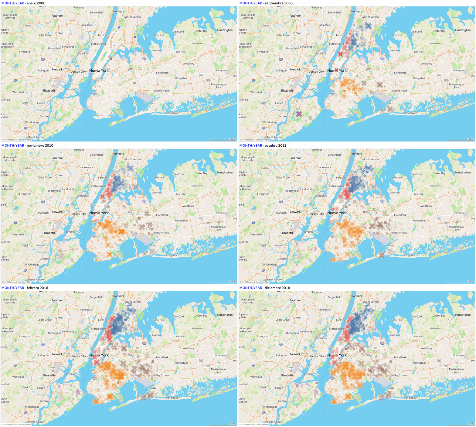
The animation in the figure above (built in TABLEAU Public) shows the time evolution of SHOOTING EVENTS in NEW YORK CITY, from January 2006 to December 20018. Colors label boroughs: Bronx, Manhattan, Brooklyn, Queens, and Staten Island. Integrating a considerable volume of shooting events and geographical data allows the identification of key emerging patterns, for example, CITY AREAS where shootings events are more LIKELY to occur. This visualization could be filtered out further by Borough, Zip Code, perpetrator age, sex, race; victim age, sex, race; etc., so more useful knowledge and insight could be extracted with a few clicks. Data for the presented example and analysis was gathered from the Official NYC OpenData site. To facilitate the website exploration, it has been embedded below. The data preparation could be performed using the R Language or, as in previous posts, in TRIFACTA wrangler software.
Using a workflow originally designed and implemented to delineate bypassed oil and pin-down new well locations in Mature Hydrocarbon Fields, Probability as well as Join-Probability Maps of criminal events (shooting+car-collisions) depicted in the figure below, were constructed (also in TABLEAU Public). These maps can be updated with fresh data, as long as it is available, so making possible to ACCESS TIME-VARIATIONS of the Joint-Probability distribution. This is an example of how to scale up from purely descriptive-statistics analysis to a PREDICTIVE PROBABILISTIC model: from DESCRIPTIVE ANALYTICS to PREDICTIVE ANALYTICS.

Once the "HOT SPOTS" associating criminal events with spatial (geographical) features have been pinned-down, the next key question is HOW THESE EVENTS ARE DISTRIBUTED IN TIME. In the next two figures below, we show visualizations of the proportion of shooting events (evaluated with the entire dataset) by DAY of WEEK and HOUR of DAY. The USEFULNESS of the integration of both SPATIAL and TIME distributions is quite clear. All the tree charts and the proportions by day of week/hour of day chart were built using Microsoft-R Language Machine Learning Server 9.3.0.
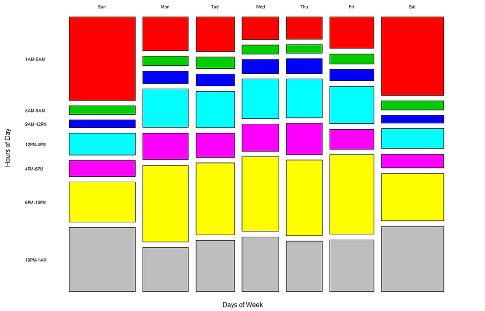

The figure immediately below shows the proportion of shooting events (evaluated with the entire dataset) by Borough, by Days of Week (top), and by Hour of Day (button). Brooklyn and the Bronx emerge with the highest proportions. Interestingly, between 5 AM through midday, shooting events drop down sharply in all Boroughs, particularly in Brooklyn and The Bronx.

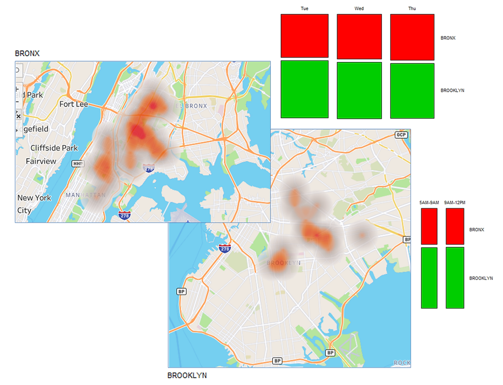
Now an example, spatial probabilities maps and time proportions are integrated, as shown in the figure below. It depicts the Bronx and Brooklyn “HOT SPOTS” pinned down previously, and the LOWEST PROPORTIONS of shooting events by Day of Week/Hour of Day; indeed, days-hours when those areas are PROBABILISTICALLY “safer”: from Tuesday to Thursday, and from 5 AM to 12 M.
Continuing with the analysis of time features, it also could be of interest to address the issue of, for example, FORECAST the number of shooting events by Borough. Accomplishing this task will require unleashing techniques of Time-Series Analysis and Advanced Visualization similar to those implemented in the previous post to predict Copper Productions. The following three visualizations and the forecasting were carried out in TABLEAU Public.
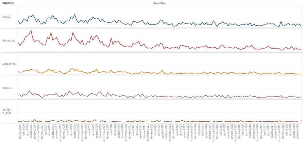
The figure above depicts the number of shootings by Borough (plotted as Time-Series) from January 2006 to October 2018. Particularly for the Bronx, shooting events show a clear decreasing trend.
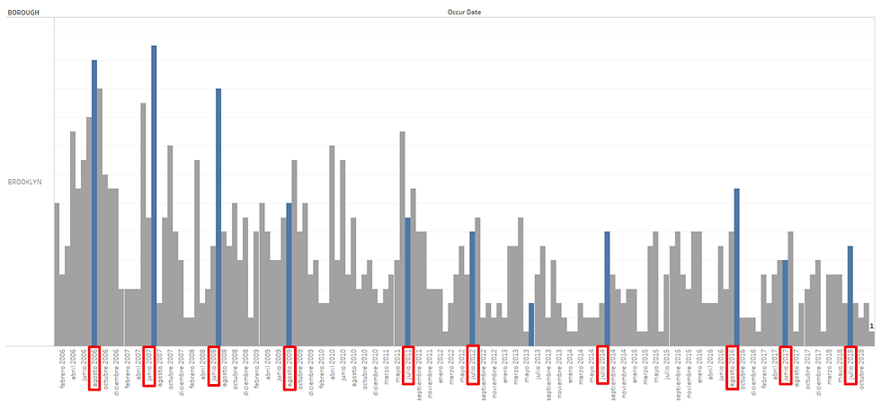
Next, a far-no-obvious emerging striking pattern is illustrated in the figure below: most of the picks in SHOOTING-DEATH events occurred systematically in SUMMER MONTHS (bars in blue date marked with red rectangles): from June to September every year.
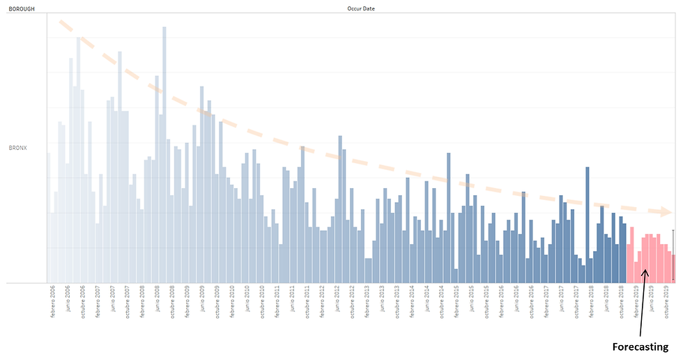
The figure below depicts the Time-Series corresponding to the borough of the Bronx and the results of the performed forecast. As was already noticed, there is a general DECREASING trend in the number of shooting events. Forecasted values (in pink) catch up with trends and historic data variations.
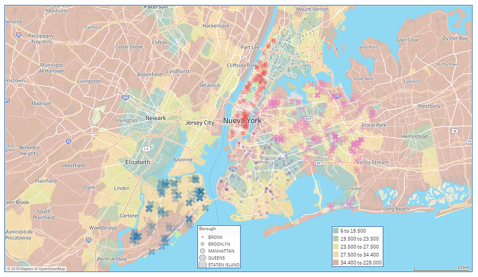
As a final interesting note, the figure below shows an example of the geographical distribution of water quality complaints regarding ODOR/TASTE/SEWER. The map background colors display Income-per-Capita: green, LOW INCOME; light brown, HIGH INCOME. It can be observed that, generally, compared with other city boroughs, low-income areas in the Bronx and Brooklyn make fewer complaints regarding the quality of public services than high-income sectors.
The presented spatial-time analysis is an example of what it is called CROSS-DOMAIN-ANALYTICS: techniques/methods currently used in the Oil and Gas Industry that can be directly adapted to successfully address issues of the PUBLIC SECURITY business and other knowledge domains.
In future posts, I’ll continue presenting and discussing more real-life relevant use cases. Please, stay tuned and don’t miss them out. And kindly share and contact me if you require additional information.


Comments